HYBRID — BUILT FOR THE PURSUIT
Client
HybridClo
Year
2026
HYBRID is a complete performance activewear ecommerce experience built around movement, community and a strong visual identity. The site combines bold campaign imagery with clean product-led layouts, interactive elements and subtle motion to create an experience that feels premium without sacrificing usability. From animated product showcases and curated collections to community stories, editorial content and the HYBRID Run Club, every section works together to build a brand beyond the clothing while maintaining a clear path from discovery to purchase.
Scope of Work

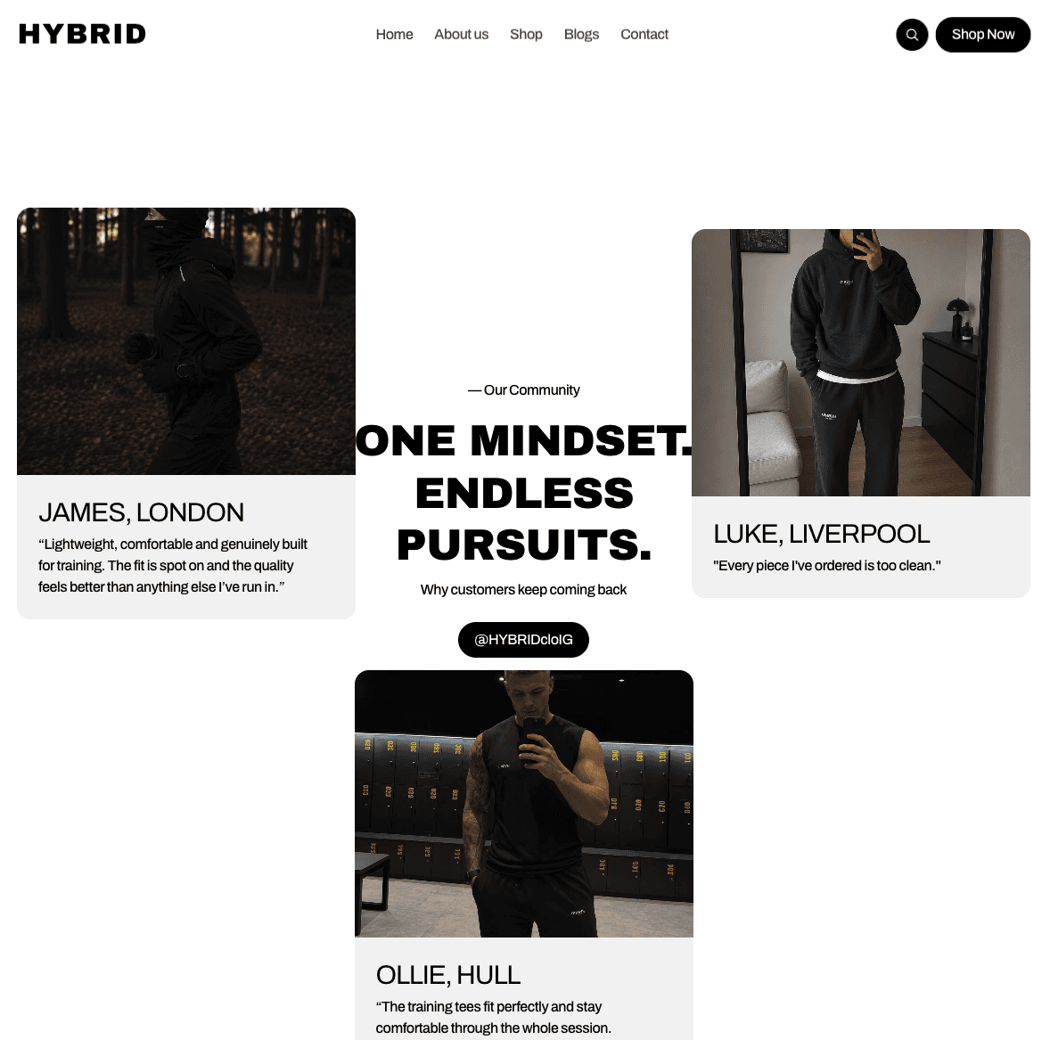
For HYBRID, we built the experience around more than just showcasing products. The Our Community section brings the brand to life through real-world imagery, customer perspectives and an intentionally editorial layout, creating a stronger sense of identity and social proof. The Our Motive section shifts the focus to HYBRID’s purpose, pairing bold brand messaging with an animated product composition where the clothing continuously rotates, adding movement to an otherwise minimal section. Together, these elements balance storytelling, interaction and ecommerce while keeping the experience clean and performance-led.

The shop was designed around a clean, product-first experience that makes exploring the HYBRID collection effortless. A structured grid, consistent product photography and minimal styling keep attention firmly on the garments, while Best Seller and New indicators provide quick visual guidance. Simple filtering and clear pricing create an intuitive shopping journey without compromising the brand’s stripped-back, performance-led aesthetic.

The about page gives HYBRID a story beyond the product. We paired founder-led imagery with bold typography and concise storytelling to communicate the origins, purpose and people behind the brand. Key statistics sit beneath the story to reinforce growth and credibility, while the minimal editorial layout keeps the experience consistent with HYBRID’s wider identity — clean, confident and community-driven.


